These projects focus on taking on a… controversial?… design and going back to the drawing board. After being in the consumer electronics industry for a few years, I’ve realized that there are MANY concessions between design-engineering-marketing-strategy in companies. I don’t fault designers and companies for the final product that we see, and many of the products I love are ones I could see redesigned. So, for each of the following projects, I’ll go into how I would focus in on KSP’s and rationale for the product, and hopefully show how a product could be better.


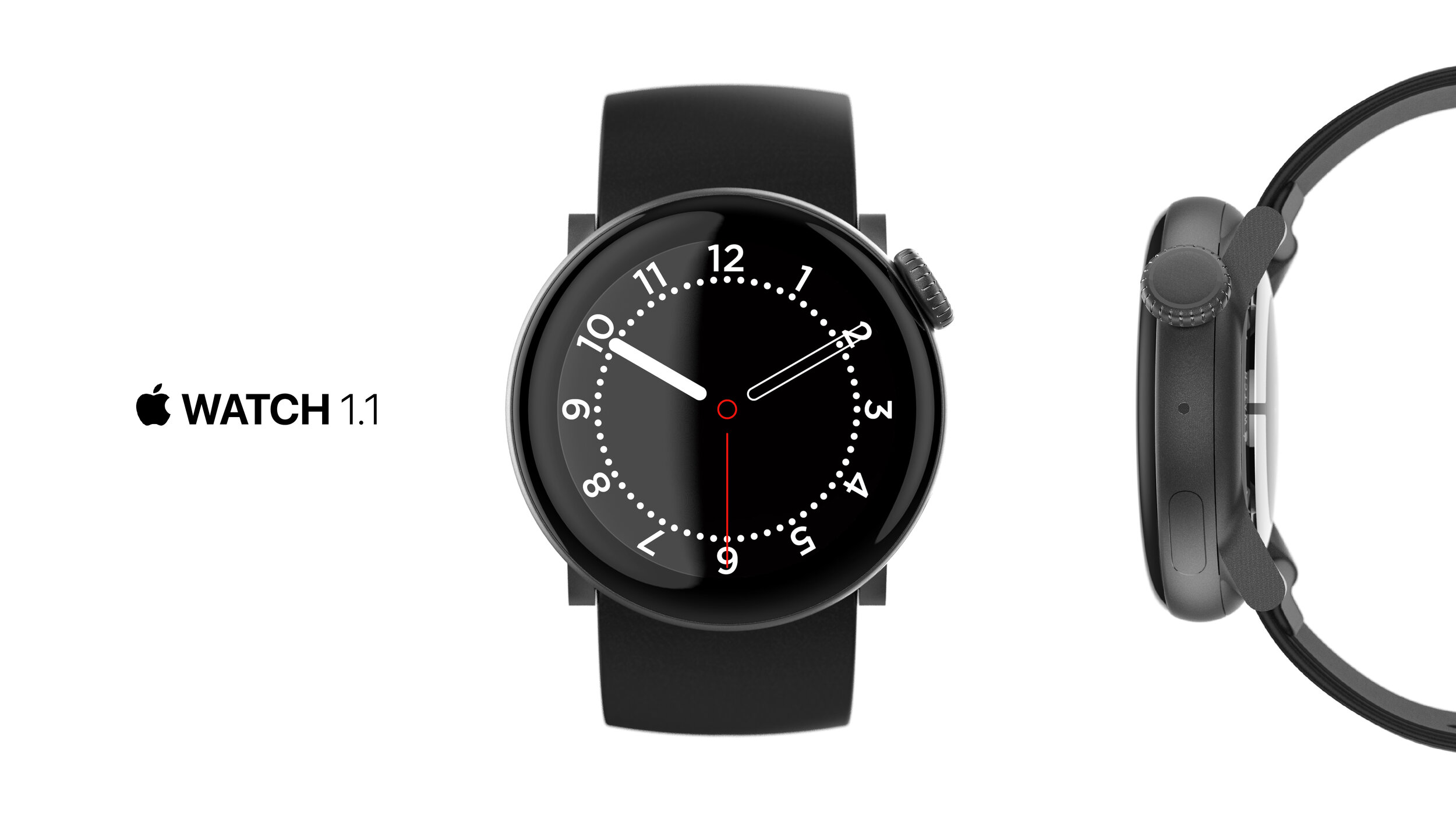
The Apple Watch is an incredible product that gives a large amount of flexibility to consumers when they buy it (GPS, data, size, material) and wear it (bands). One of my first personal projects I completed back in my college years was a smart watch to accompany the original MotoX. When I interviewed for an internship at the time, someone asked me why I had designed it to look so much like the phone itself. I knew I wanted the designs to match, but maybe it was a little weird to have a phone-like object strapped to your wrist when watches are supposed to be a fashion item. I look at my own Apple Watch 5 and iPhone in the same way; are they too similar in form factor? The Watch is pretty much a scaled-down ID of the phone and when I see it on someone’s wrist, it looks a bit too tech-y. You expect a screen on a square device and it immediately takes away some of the elegance of the design itself. So, why a square? Bezel-size is one reason (the screen driver at the bottom of the display is a straight component). The battery and Haptic Engine components are rectangles so a squarer shape is more efficient. But, I think OS is probably the biggest reason. Apple loves squares with round corners and those don’t fit well on a circular screen. The problem is, so much of the WatchOS layout looks like it should be on a circle; the app menu, the circular watch faces, the fitness layout. Apple made many changes to the OS from iOS, so why not keep going and make the form factor something people are more accustomed to and will increase the perception that it is more a watch than small phone strapped to the wrist? Also, this may just be personal preference, but I do not like circular watch faces on a rectangular form at all. I understand that the corners can be used for complications, but I still see all the wasted negative space.
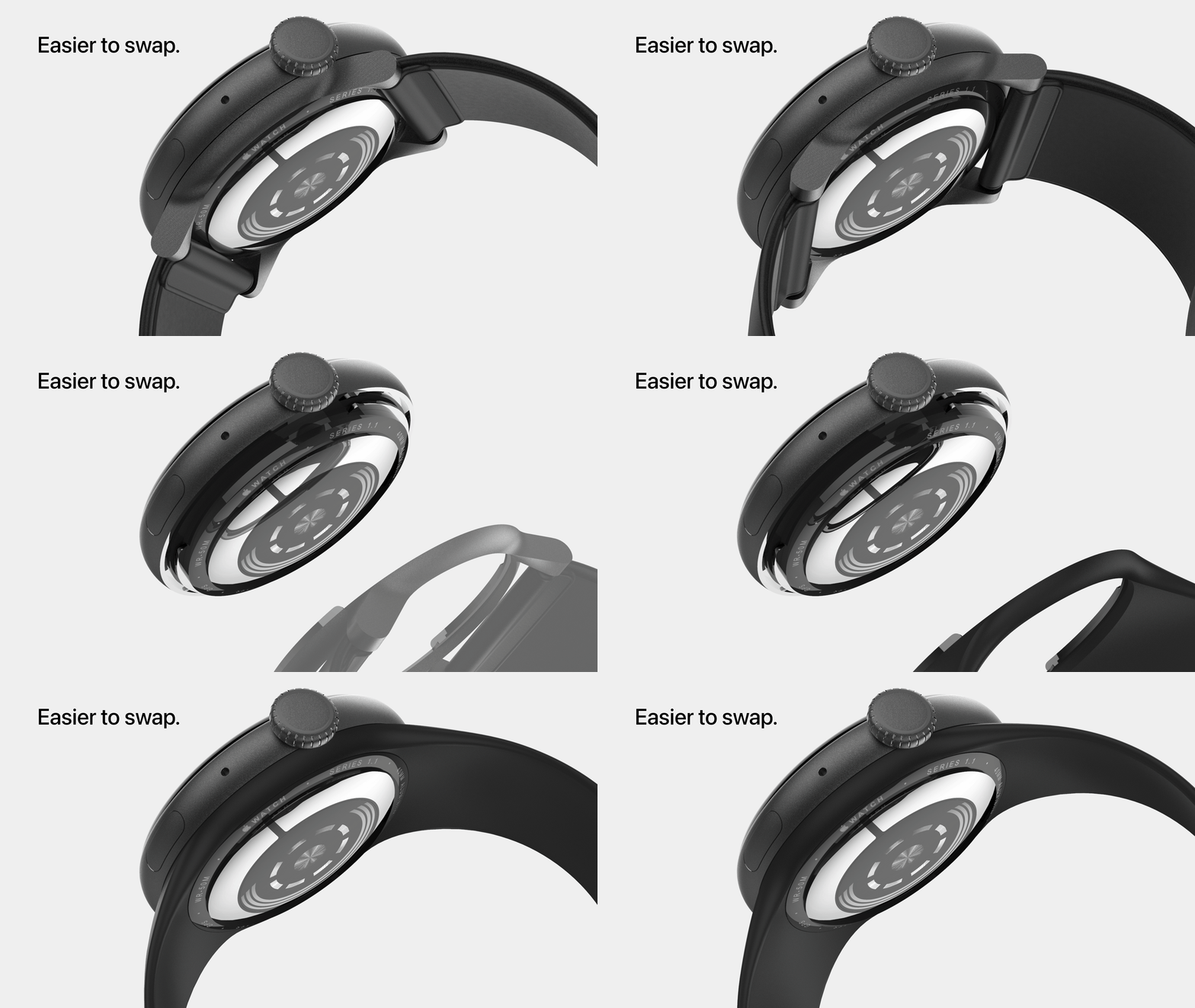
I created an engine based off of the original, with the biggest change being the display and board-size increase (and probably slight thickness increase for battery dimension change). This decrease in engine-packing efficiency increased the bezels slightly, but is a concession I’m willing to make for the overall form factor. In addition to the form factor, I modified the strap-swap mechanism to a less mechanical one. I have somewhat thin fingers and I struggle to hit the buttons to swap bands, so I can’t imagine how hard it is for other people. I used a simple detent which should (when tuned) feel quite nice when clicking a band in and out. Personally, I love the concentric look of the sensors on the bottom. It reminds me much more of the window on the underside of an automatic watch. You may also notice the placement of the crown. One thing I really dislike about the Watch design is the placement and axis of the crown. Not only does the back of my hand hit it when I’m golfing or lifting weights (I had to turn off hold for Siri), but the angle is really awkward. So awkward, that I almost never use it and instead scroll using the screen itself. Just test the angle of mine on your wrist compared to the original and you’ll see the huge difference in usability. This does, however, once again affect the efficiency of the packing the engine.
I tried my best to realistically change the overall size and bezels to reflect the form factor I’ve chosen so we have a more accurate comparison. As far as I can see, I would give an extra few millimeters to have the classic circular watch.


The Sony Playstation has been around since 1994 and is, to this day, considered the best console gaming system (mostly based on their game partnerships). It’s a strong brand and personally, my childhood was filled with days spent playing the PS2 and now I have the PS4. I was very confused when the PS5 design was unveiled; it didn’t match their design language. Maybe it was because the previous generation of both XBOX and PS were on the boxier side and XBOX Series X continued that motif, that I expected a boxy design from Sony. I think the best way I could explain it to myself (and literally anyone I could get to talk to me about the design legacy of gaming consoles) was that Sony has always had a mid-century modern vibe to their consumer electronics; very planar and hiding details/venting in layers molded into their plastic housings. In Playstations, this started with the PS2, had a slight evolution in the PS3, and came back heavily in the PS4. The PS4 also brought in the shifted layers motif which I thought was very interesting for such a simple design. With the introduction to the PS5, Sony suddenly went from flat, planar, and layered to a more Zaha Hadid inspired look. Personally, I love Zaha. Her designs were always unique and futuristic. The problem is that her designs are meant to be disruptive and disruptive doesn’t work in peoples’ living rooms. Which is where my problem with the PS5 begins. The console only looks good in vertical orientation whilst all other Playstations look great in both, it stands out far too much in 95% of living/bed rooms, and the final problem with the design in my eyes is that the disc version looks like an afterthought. I believe that they could have made a cleaner evolution from digital to standard console if they kept the planar look.
For my redesign, I tried to keep the footprint the same (somewhat difficult with the console not being available to the public). My main concerns were airflow and the massive heatsink below the engine; I know how cooling is going to be the biggest problem for the next-gen consoles. In my design, you can see that I had a step down to reveal the heatsink so that some overall mass could be hidden and slim down the perceived size of the console. To solve airflow, I brought in a PS2 inspired grill between the white shells. For the overall profile, I brought in the shifted look from the PS4 which brings in a lot of the dynamism and movement that Sony wanted with their PS5 design. To modify the console from digital to disc versions, the left side (in horizontal orientation) is modular and can be factory customized. This makes the overall manufacturing a little more efficient and makes the difference between the two less visibly jarring.
I compared the actual PS5 design to Zaha Hadid’s architectural style, and my design objective was to redesign it with the style of Frank Lloyd Wright. The style is more space efficient, is more versatile in fitting into consumers’ dwellings, and aligns itself better within the Playstation design language.


Probably as polarizing a design as it gets. The announcement of the Tesla Cybertruck was meme-able, different, and as nerdy as it gets. Tesla cars have, in general, pushed boundaries on what norms can be broken in terms of what mass-manufactured cars can look like because of how forward-looking the company is (the removal of an unnecessary grill on the front is one of my favorites). Elon Musk has said many times that Tesla does not release “concept car” designs as all of their concepts will eventually be released as consumer ready vehicles. The world wasn’t quite ready for the Cybertruck. Sure, the specs are incredible as trucks go, but those who usually buy trucks have a specific look they have in mind. Ford, Chevy, and Dodge have been progressing their styling for decades in a way that truck-buyers know what to expect and are happy to buy an updated look with a couple of new features. As a kid from the Mid-west, I’m all too keen on the rivalry between truck owners as it comes to their respective makes. It will take a lot of work to get a stubborn Hoosier to switch from their Ford to literally anything else. Now, tell them that they now have higher torque, higher top speed, bullet-resistant materials, batteries to power tools, etc. and you might just get them to budge. BUT. And Tesla gave them a big “but” to consider: the styling.
It took me a week. Sure, for the first moments when I saw the Cybertruck, I thought Elon was kidding. WHAT WAS THIS THING. But then I understood what the Cybertruck was. It’s an indestructible object for people who drive in rough environments. It needs to look protective. This motif, along with the constraints of the materials meant all of the surfaces had to be planar. The truck that Tesla unveiled looks somewhere between a post-modern home and a stealth battleship. What does that translate to? Cutting-edge design, technology, and defense. Everything that the Cybertruck promised to be. The problem is that Tesla took it juuuuuust a tiny bit too far. It skipped too many years of design to be released and expected to be adopted by the public that actually needs trucks to do work with.
The solution? More facets. Go from 8-bit to 16-bit to better translate the silhouette of what people expect a truck to look like. Make the roof-line flat because it kind of looks like a house when it peaks. Bring in some of the design language from the Tesla sedans so that people can visualize something they have seen before. All-in-all, a design doesn’t have to be all that austere in order to push it into the realm of futurism. It still needs to sell to the intended buyer.
I hope you like my “V2” of the original Cybertruck, but I did have one problem as I was working…
As I was adding details, I had a weird realization that maybe I’m missing something, and it occurred to me that Tesla may have me on the Cybertruck’s “it” factor. My design, though it may seem more approachable to a mass-market, lost some of the jeuge that made me fall in love with the styling of the original. That peak in the roofline is so unexpected, simple, and maybe even silly that I couldn’t help but respect it. My version is realistic for mass-market adoption, but the Cybertruck is memorable (of course, I’d hope mine would be too). Their truck can be drawn from memory, even by a child, and you’d know which make it is. Elon Musk lives in a world of making memes. The stock market rises and falls based on a single tweet. The Cybertruck is another example of his hook. Everyone knows about it and can’t get it out of their heads because it’s problem (being polarizing) is actually a benefit. At some point, even the biggest Ford fan might just think “that Cybertruck looks so dumb to me, but man it hauls”, and the fact they’d even remember to consider it means Tesla won.
